ACCESSIBILITY
Designing Cyber Gomoku for more players
Cyber Gomoku aims to make its controls and rules understandable to first-time players across language and color-perception differences. Although it is an independently developed game, accessibility has been part of the design from the beginning.
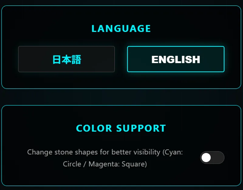
Switching between Japanese and English
Because Gomoku is played internationally, menus, rules, and in-game instructions are available in Japanese and English. A familiar settings icon remains recognizable even when a player cannot yet read the current language.
All interface copy is stored in shared translation data rather than scattered through the game code. When a feature is added, missing translations are easy to identify, and another language can be introduced without rewriting game logic. The same approach later helped the GamePix edition of Magicians Daifugo support about ten languages.
Distinguishing stones by more than color
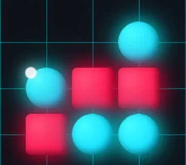
The standard theme uses cyan and magenta stones to match the cyber setting, but color alone may not reliably distinguish the two sides.
Color-vision support adds shape as a second cue: cyan stones use circles, while magenta stones use squares. Bombs and other abilities also retain recognizable shapes and symbols when their colors are difficult to perceive.
Using more than one visual cue for the same information is known as redundant encoding. It helps players with color-vision differences, but it can also improve legibility in bright sunlight or on displays with unusual color settings. The feature is intended to make the board clearer for everyone.
Using consistent icons
Stealth Stone, Stone Bomb, and Stone Radar each have a distinct icon. The same symbols appear in the rules, pre-match selection, and ability controls so their meaning remains consistent across screens.
Important controls also include names or explanatory text instead of relying on icons alone. Shape, color, and copy work together to clarify each action.
Keeping the rules available during play
Players should not have to memorize Gomoku rules and three unfamiliar abilities after a single introduction. Rules and ability descriptions therefore remain available during a match without navigating to another page.
The opening tutorial covers only what a new player needs to begin. Detailed specifications remain available on demand, allowing each player to choose when they need more information.
Accessibility is easier when planned early
Accessibility is often postponed, but retrofitting it can require changes across the entire interface. Extracting copy into translation data or adding shape variants after release affects many screens and components.
Building those foundations early keeps the additional work small. Independent development is well suited to this approach because specifications can change quickly. Accessibility is treated as part of the game's standard interface, alongside the title screen and sound, rather than as a separate feature.
Continuing to test real usage conditions
The current features do not address every need. Keyboard navigation, screen-reader behavior, font size, contrast, and narrow-screen controls all require continued review.
If you encounter a problem or unclear instruction, report it through the contact page and include your device and browser. Reports from real environments help guide future improvements.